
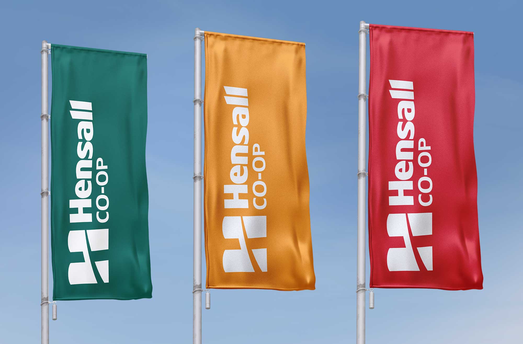
Hensall Co-op rebrand — regional brand identity honoring 80 years of agricultural heritage

Hensall Co-op Rebrand

Evolving a local co-op identity into a cohesive regional brand while honoring 80 years of heritage.

Brand Strategy
Logo & Identity Design
Brand Guidelines
Art Direction
Naming
Objectives/

Hensall District Co-op (HDC) required a new brand identity that reflected the true scale of its operations while respecting its long-standing history.

  • Align the brand’s visual identity with the scale and complexity of its operations
  • Retain brand equity and heritage built over 80 years
  • Establish consistency across all divisions, touchpoints, and communications
hensall-co-op
Strategy/
Solution

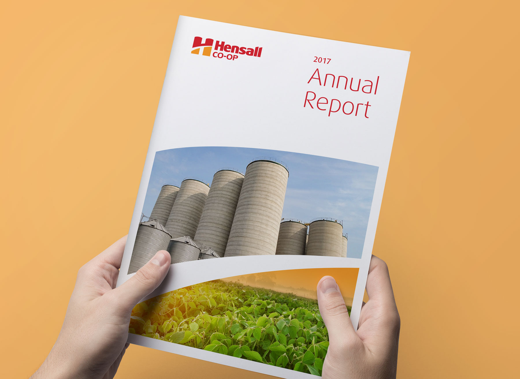
The brand was strategically simplified to Hensall Co-op, retaining heritage while acknowledging the organization’s operating headquarters and expanded regional presence.

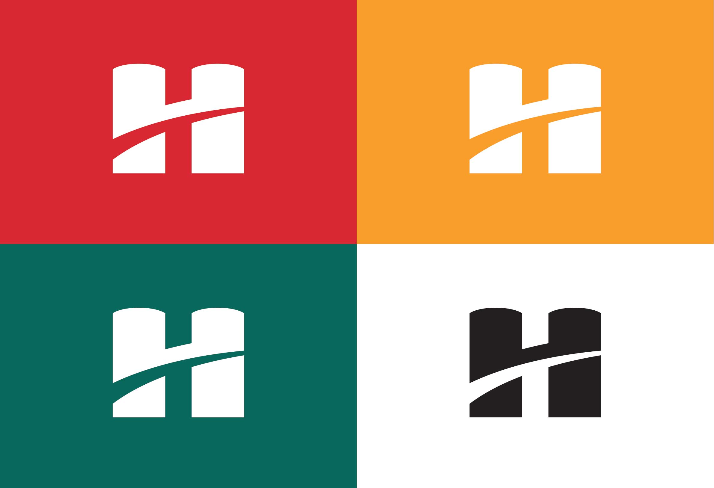
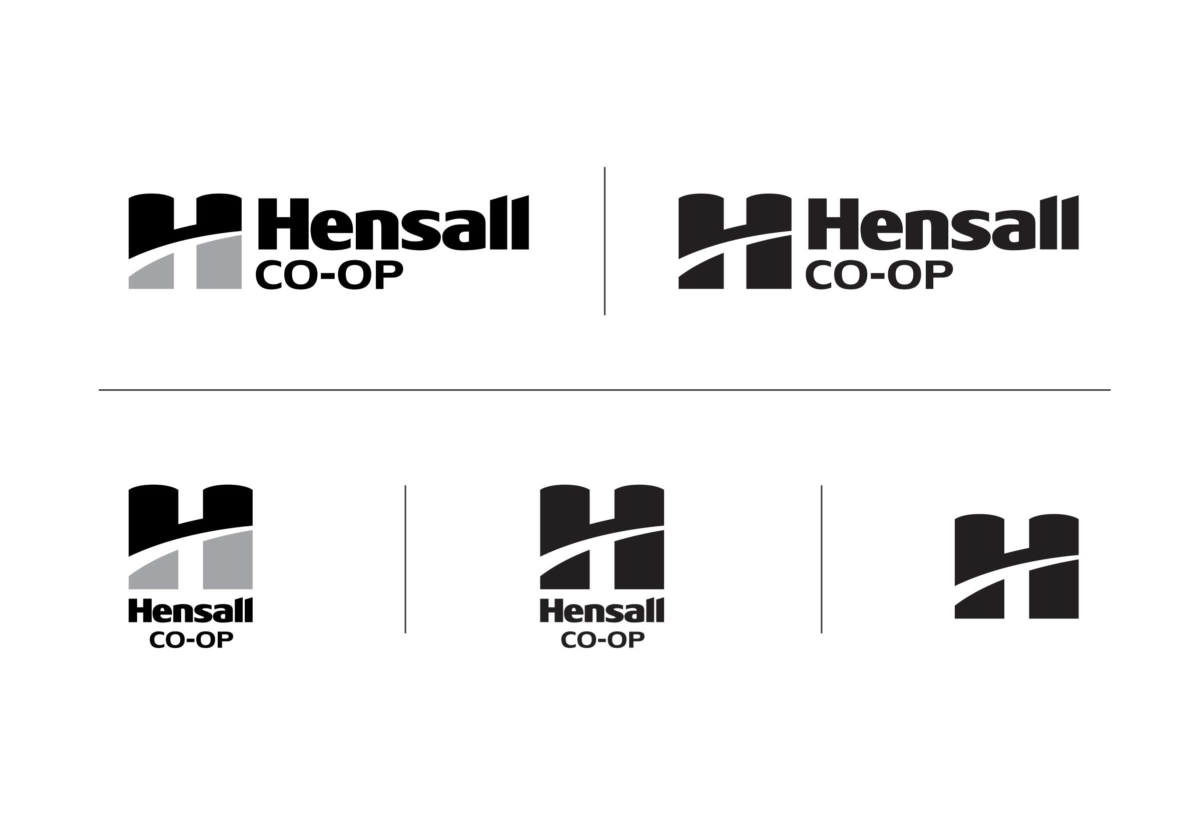
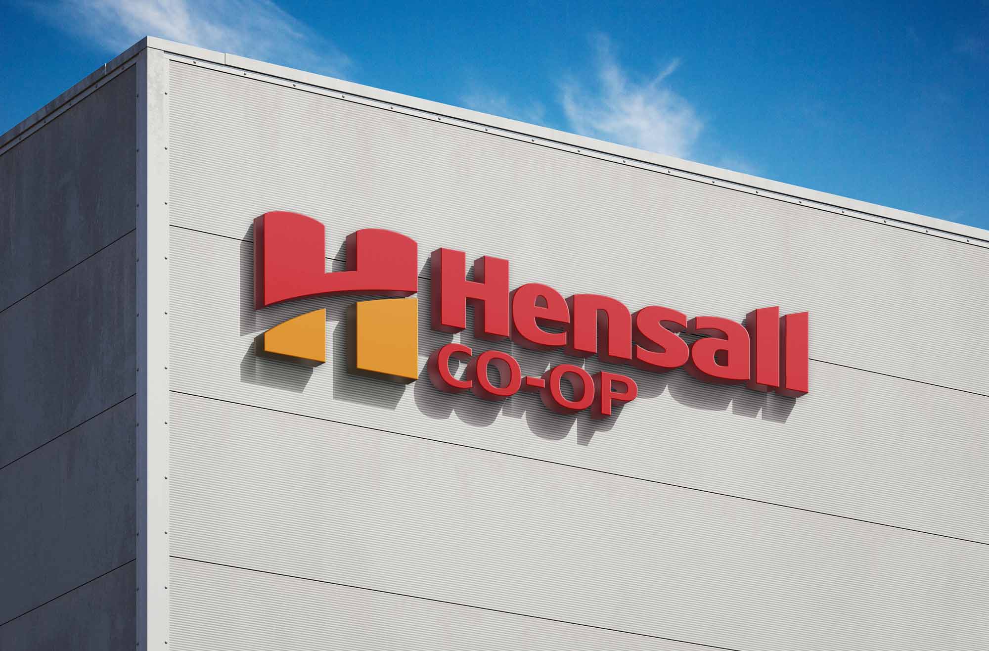
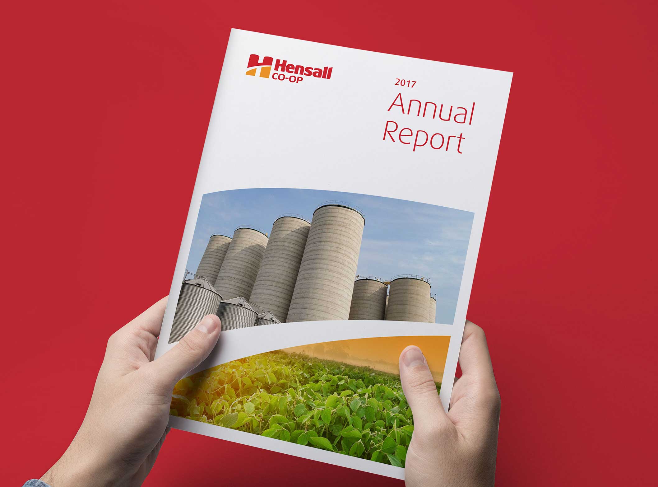
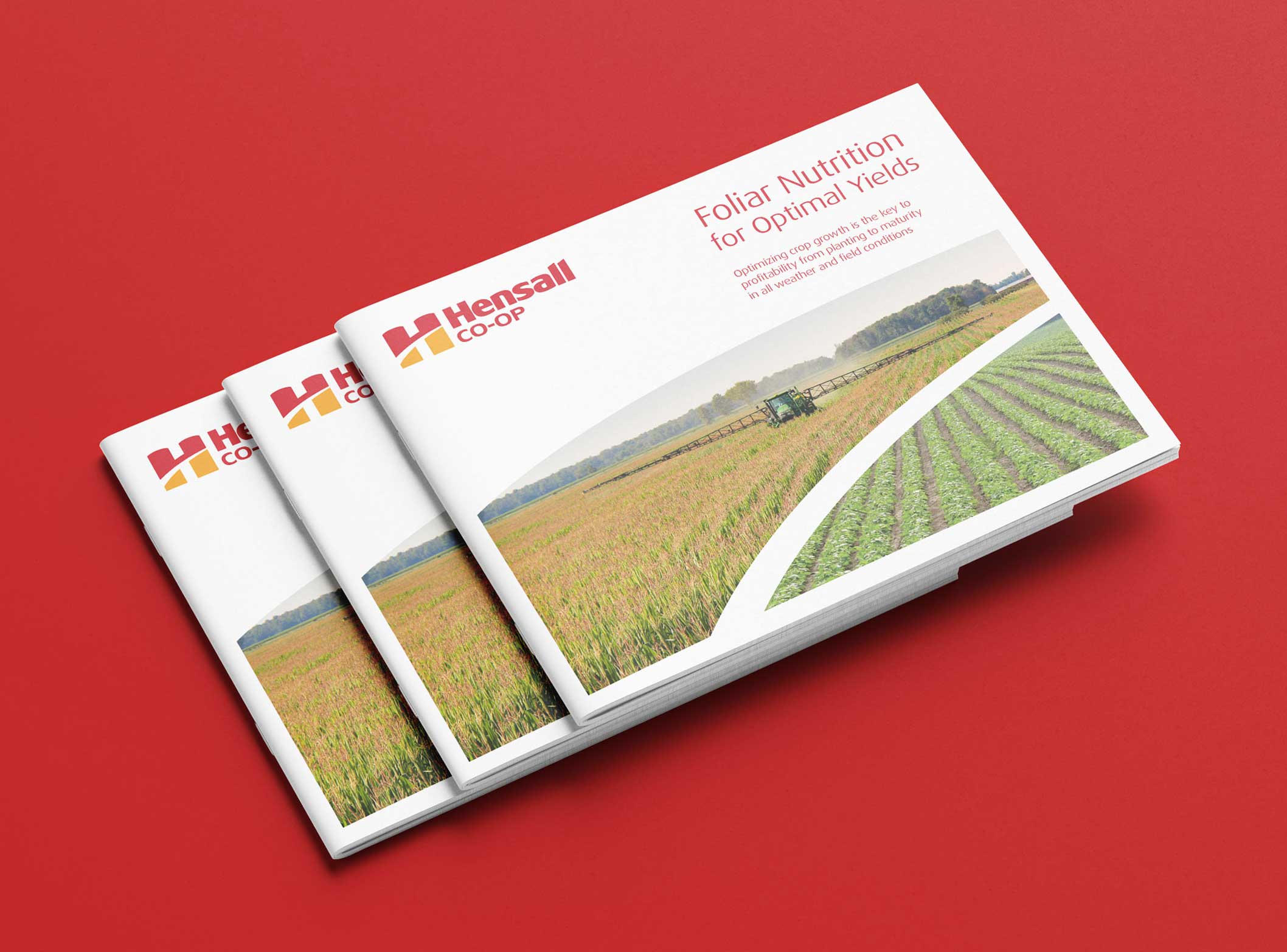
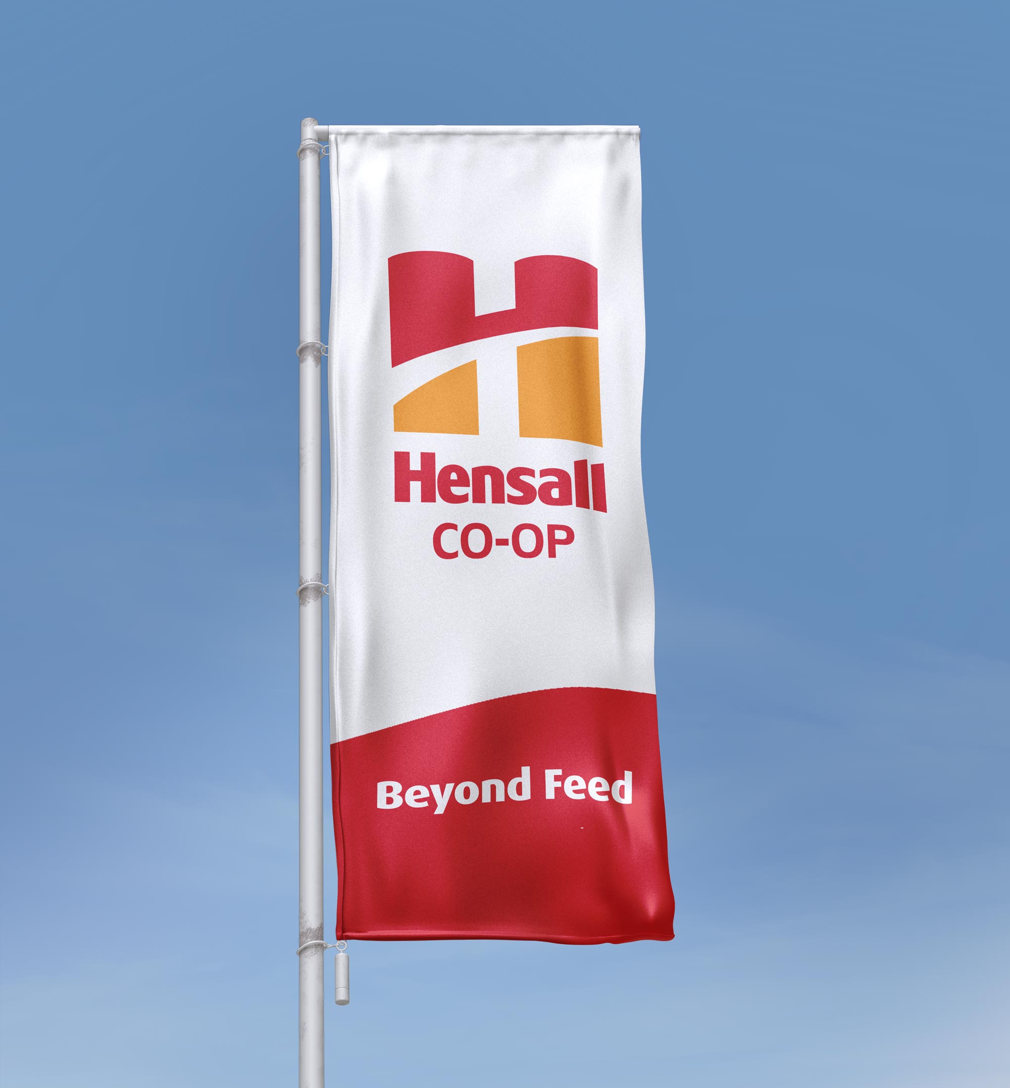
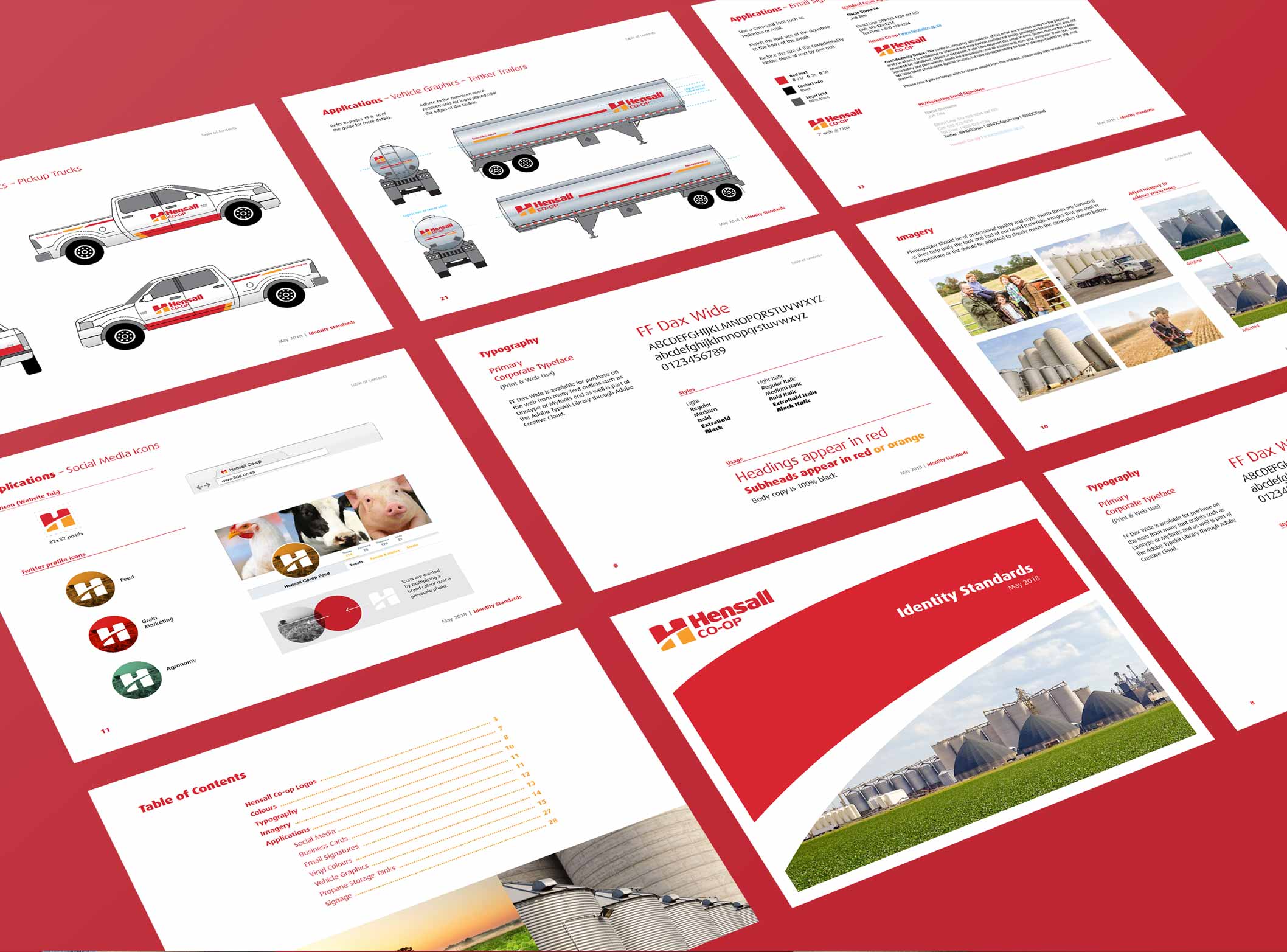
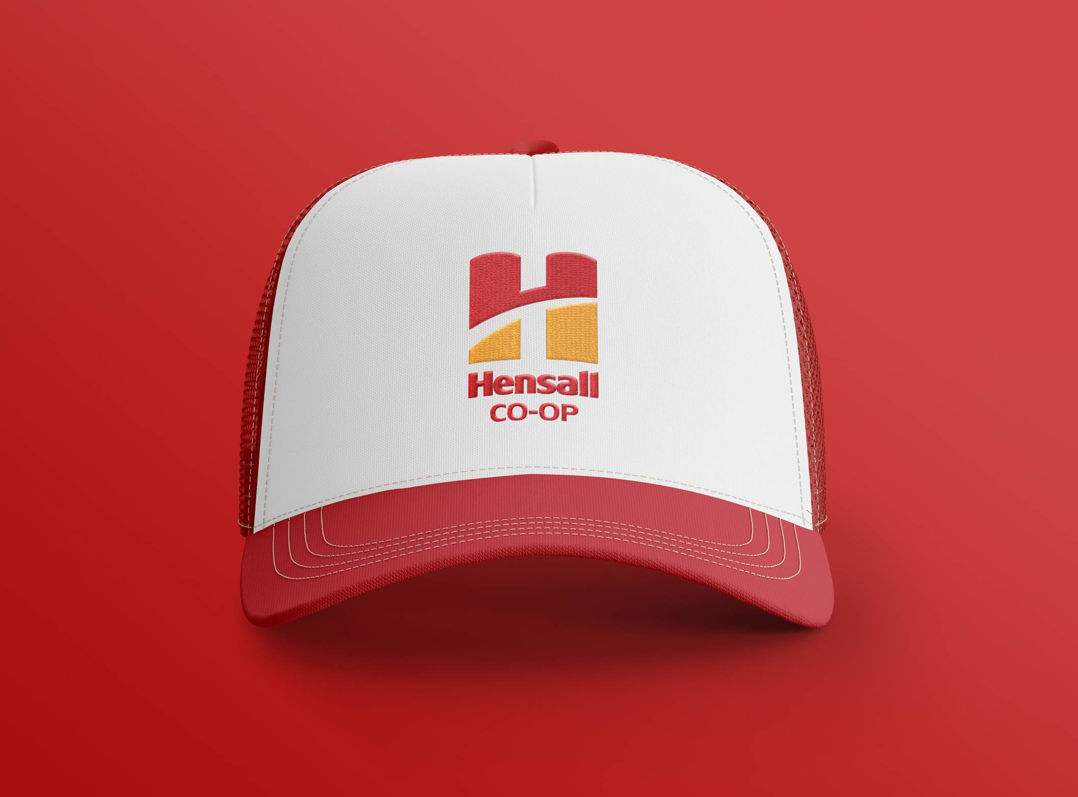
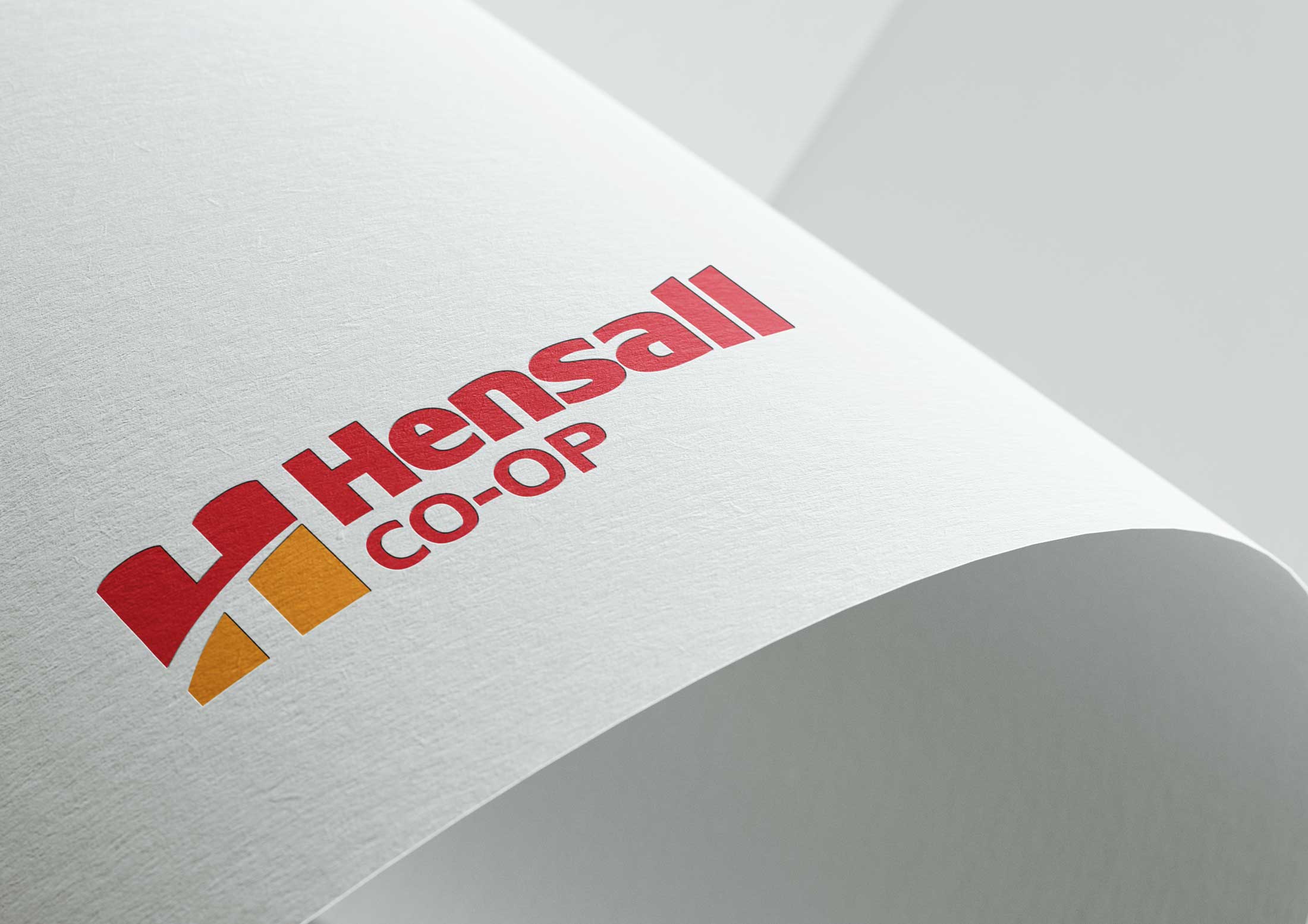
The new logo was built around the co-op’s most recognizable asset—the grain silos central to its operations. The existing red was retained to preserve equity, while a complementary yellow was introduced to add contrast and warmth. Together, these elements divide the icon into abstracted field and sky, grounding the identity in agriculture while modernizing its expression. Ongoing collaboration with the leadership team throughout the process ensured alignment, clarity, and confidence across all divisions. A comprehensive brand standards guide established clear visual and messaging framework to support consistent execution across all marketing efforts.
Hensall Co-op Logo horizontal
hensall-co-op
hensall-co-op
hensall-co-op
hensall-co-op
hensall-co-op
hensall-co-op
hensall-co-op
hensall-co-op
hensall-co-op
hensall-co-op
hensall-co-op
hensall-co-op

*Work completed while employed at ON Communication Inc.