
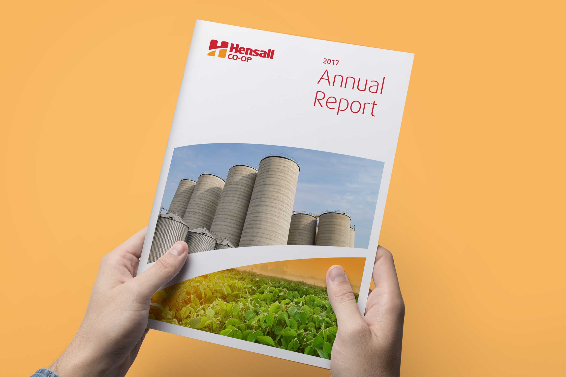
Hensall Co-op annual report design — editorial layout reflecting new brand direction

Hensall Annual Report

Signalling a clear shift in leadership, direction, and confidence under a new brand.

Publication Design
Art Direction
Objectives/

Following the Hensall Co-op rebrand, the annual report became the first major communications piece to fully express the new identity. It needed to clearly articulate the co-op’s refocused leadership direction while resolving long-standing issues of cluttered layouts, fragmented messaging, and inconsistency across operating divisions.

  • Introduce the revised brand through a high-profile communications pie
  • Communicate unified direction across all five operating divisions
  • Improve clarity, readability, and strategic focus compared to previous reports
hensall-annual-report
Strategy/
Solution

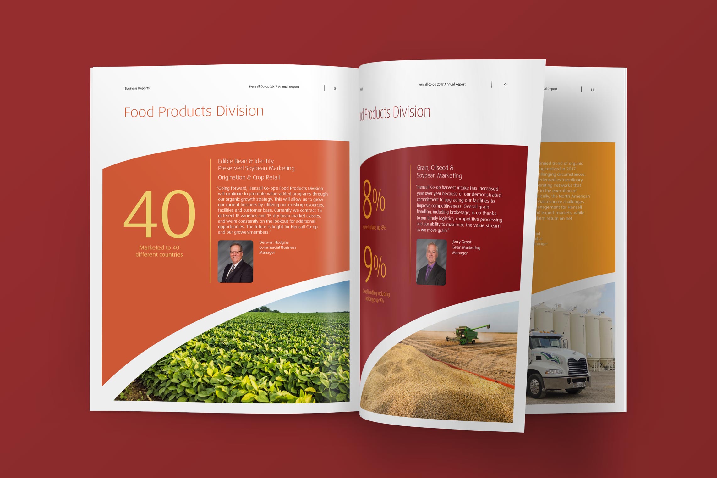
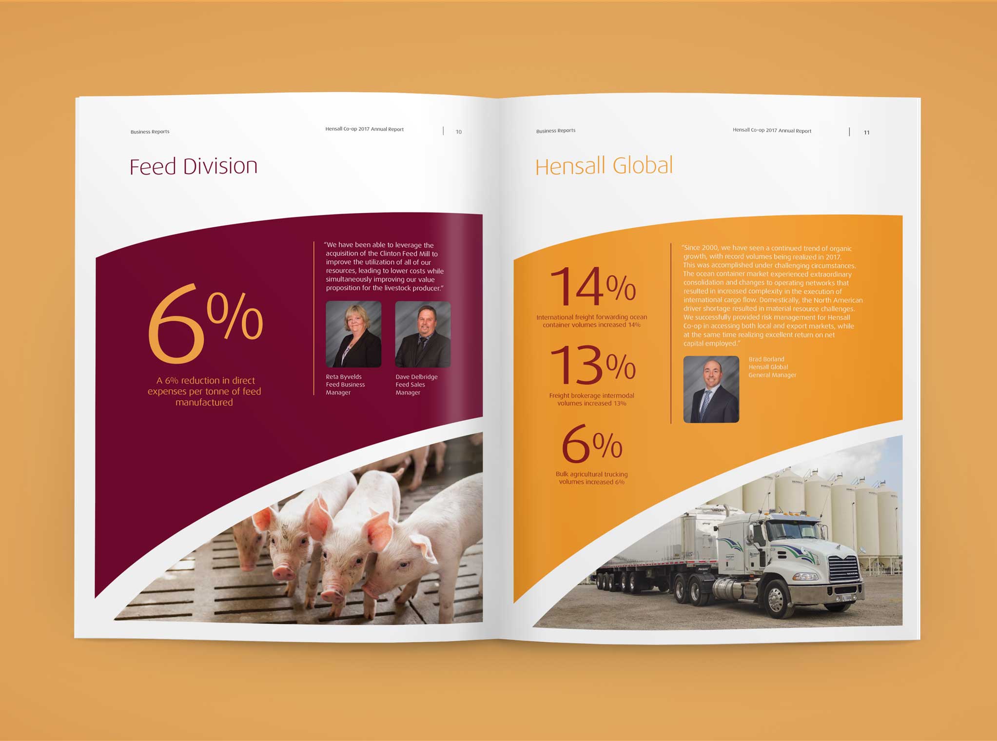
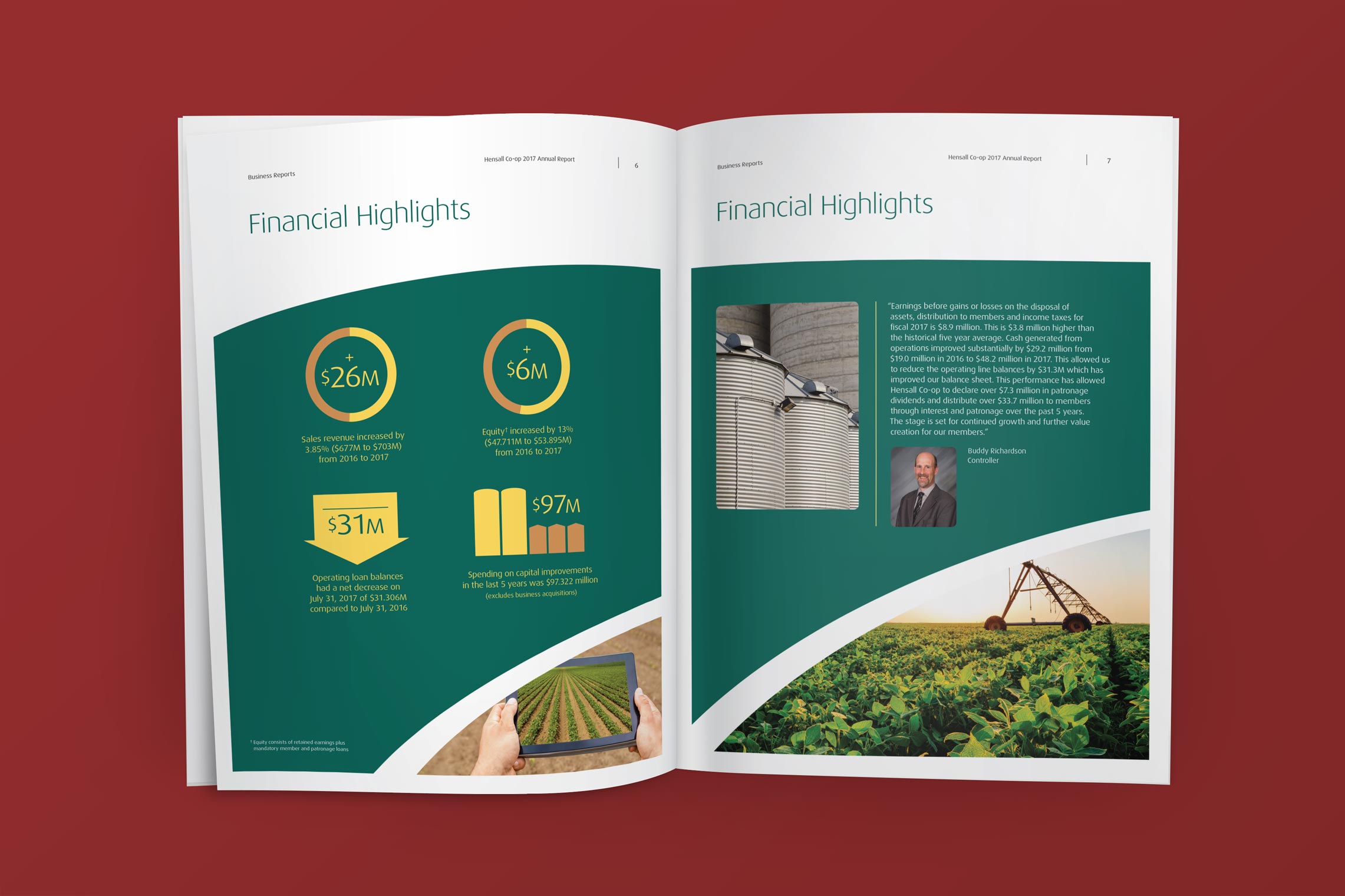
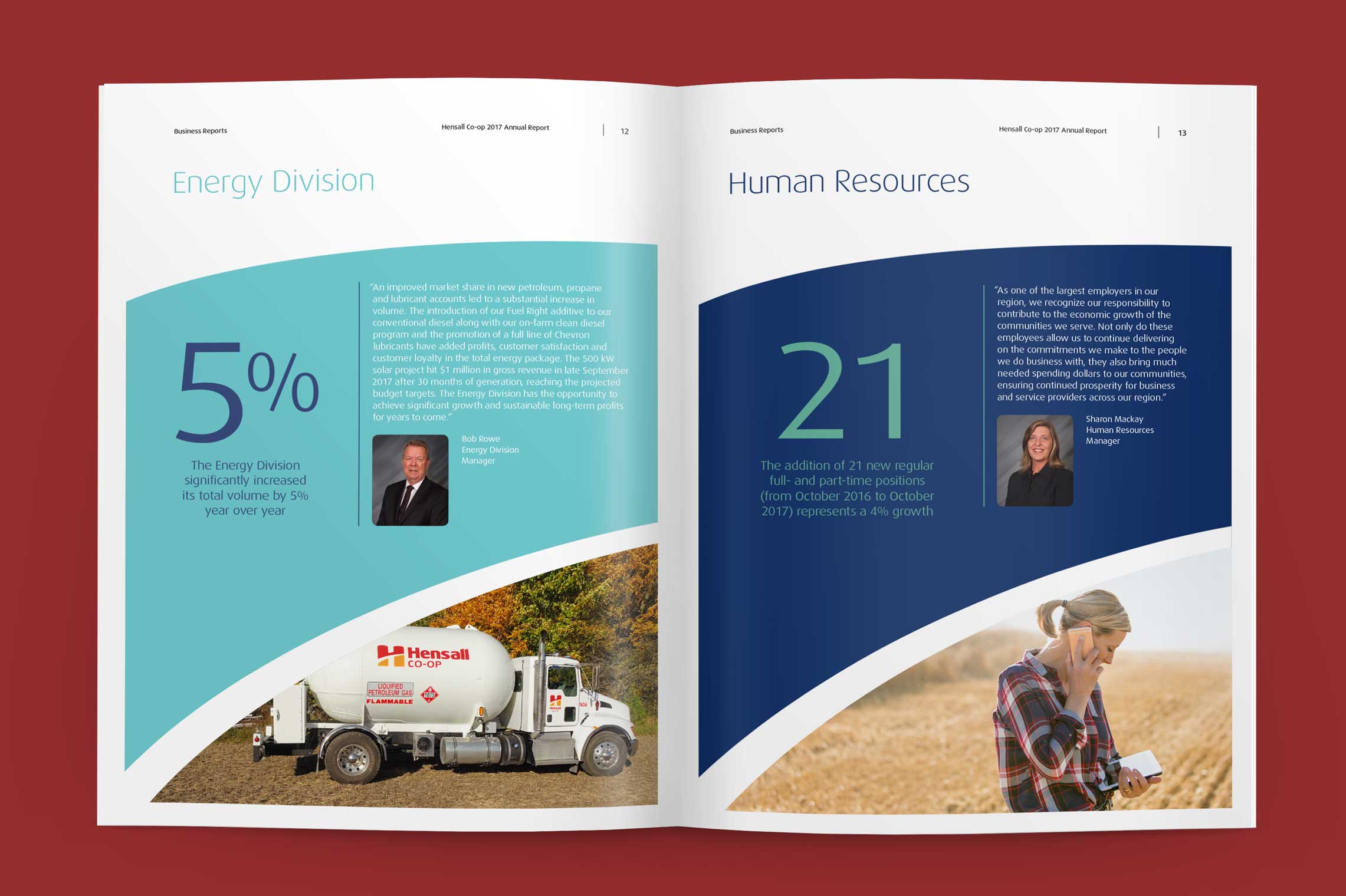
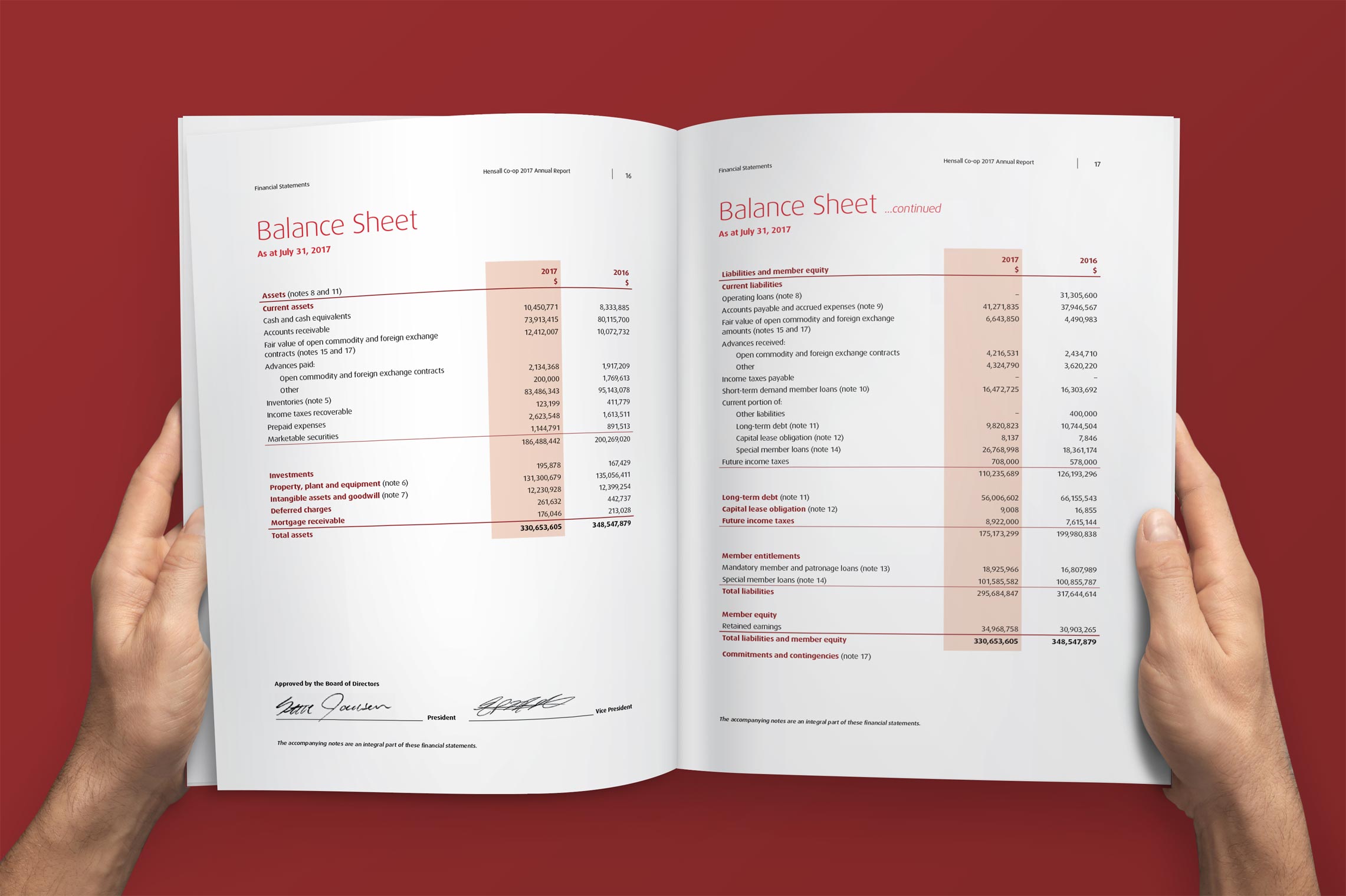
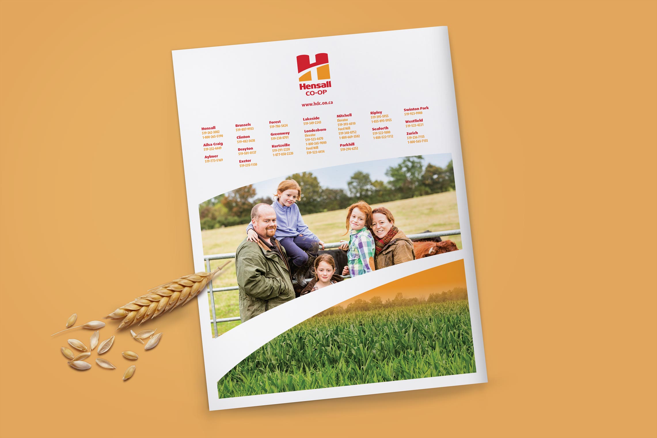
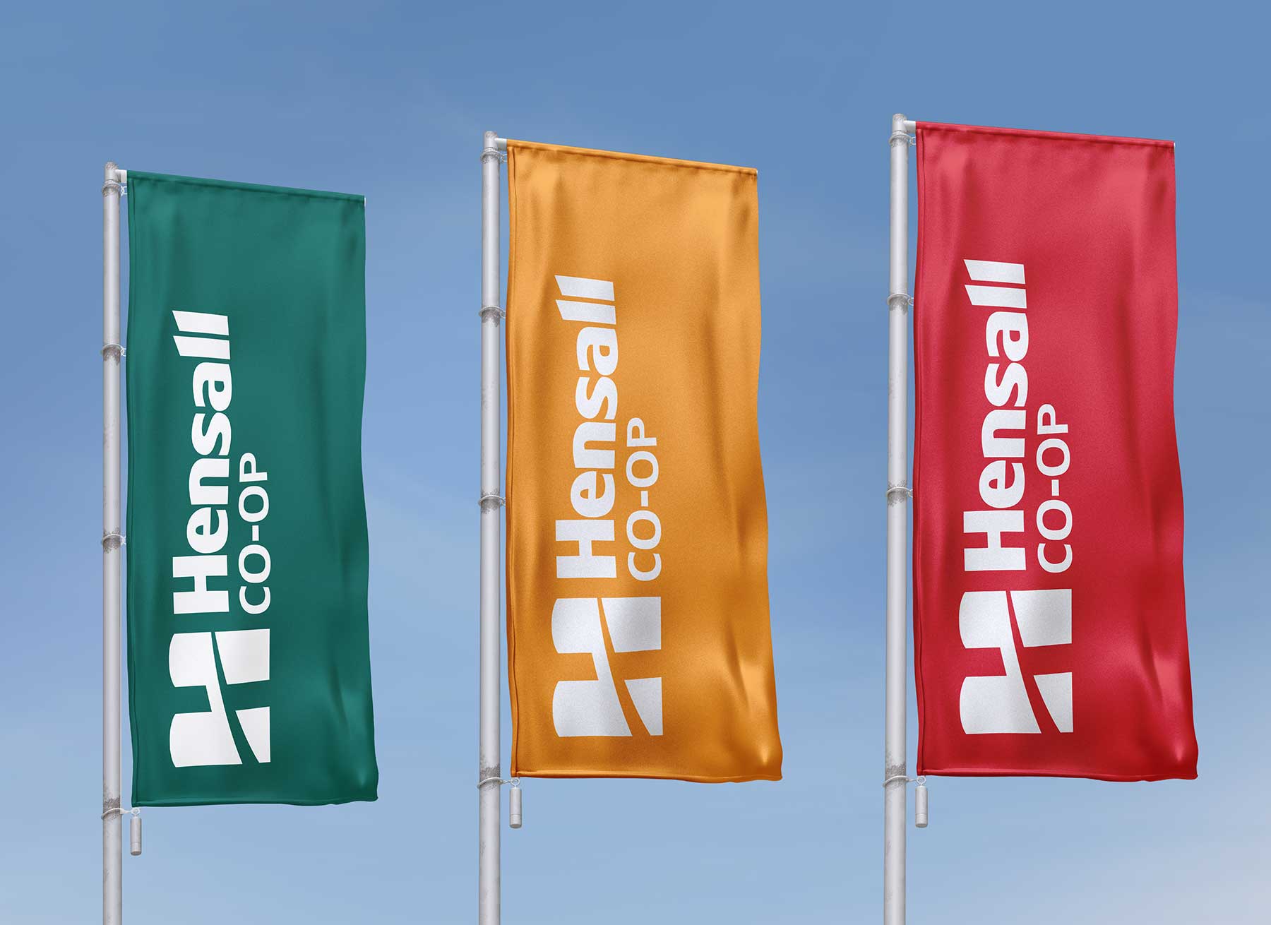
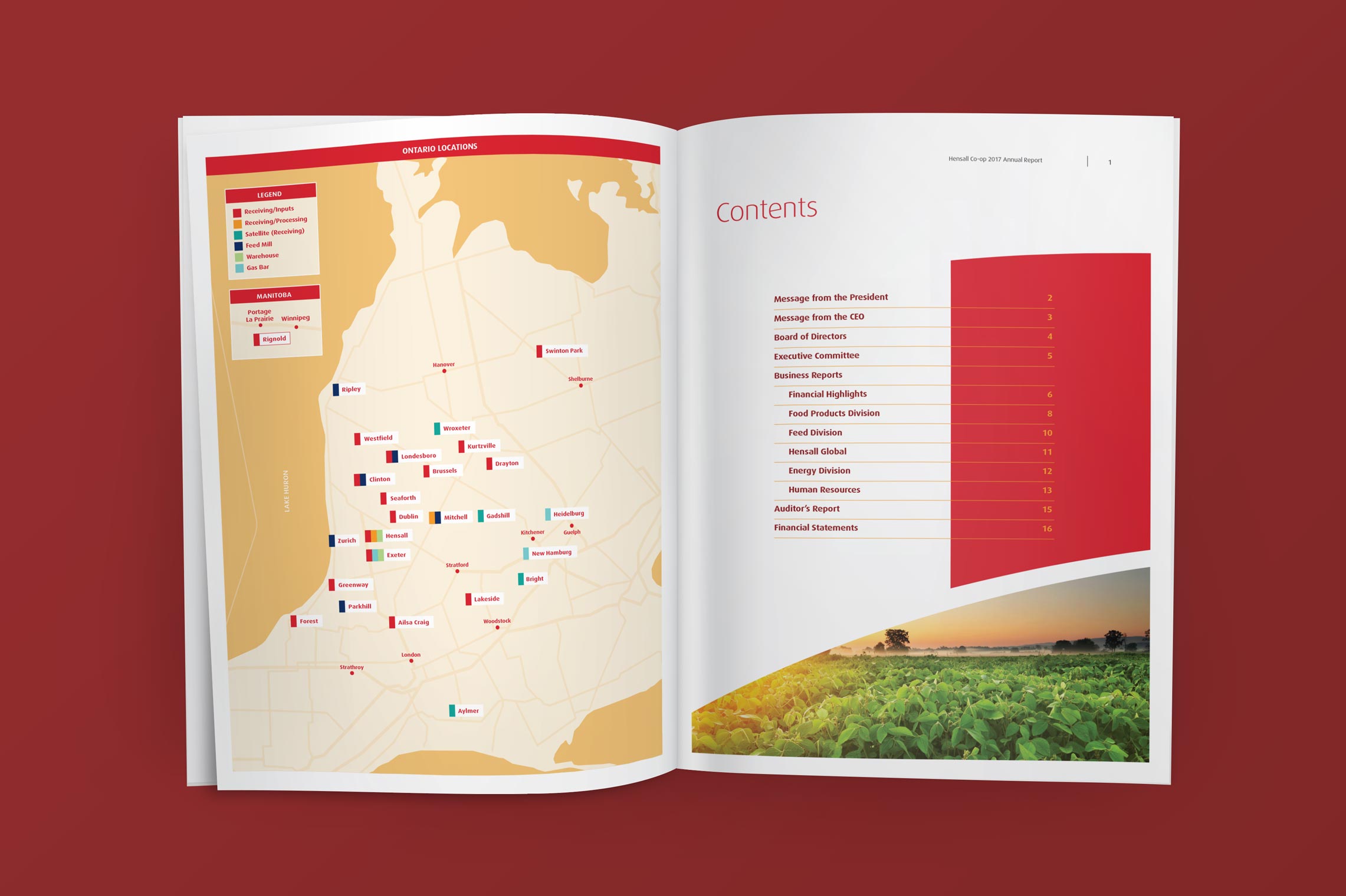
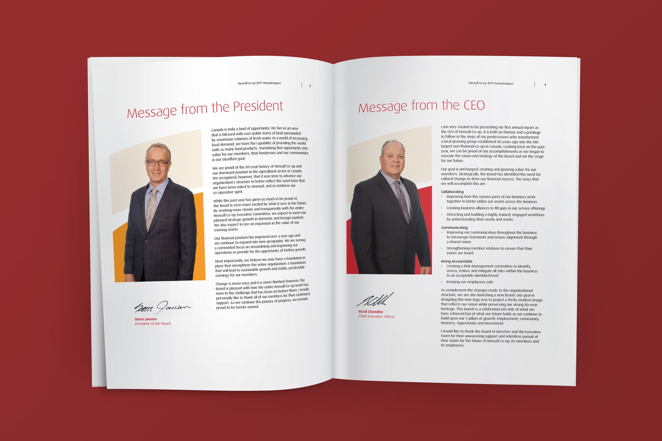
The annual report was designed to showcase the new brand boldly and consistently, establishing a unified look, tone, and message across all five divisions. The visual language drew directly from the identity system, with graphic elements and structure echoing the form and rhythm of the logo.

Strong photography and disciplined layouts created clarity and hierarchy, while highlighted statistics and concise performance summaries from each division leader reinforced transparency and accountability. Together, these elements presented a confident narrative of progress and alignment.
hensall-annual-report

*Work completed while employed at ON Communication Inc.